On observing the raw data from many, many markets at sub second precision, I've come to realise that analysis of the *rate of change* of a price, volume or vwap is very difficult to ascertain when using traditional comparison methods (i.e. it's normal to compare the current ltp from now with the ltp from 5, 10, 15 seconds ago etc, etc. likewise with money on the back or lay side).
Pondering this conundrum made me reach for excel as I knew that the Slope() function would give me an arbitary *index* as to the rate of change of a series of data points over time. In effect, the Slope() function (for our application) takes parameters of time and value range and returns a single index indicating the *angle* related to the change.
How will this helps us?? If we can plot a series of Slope() indexes into History Lists (i.e. comparing current with value 5-10 seconds ago ad infinitum), we'll very quickly have a profile of the rate of change on any of the data elements that we are interested in (be that a positive or negative index). Inside a BA rule, this would be invaluable as it would allow us to monitor for either plateaus or accelarated changes in any of the data elements that we are monitoring. So in effect, we would be able to *spot* the rate of change far easier.
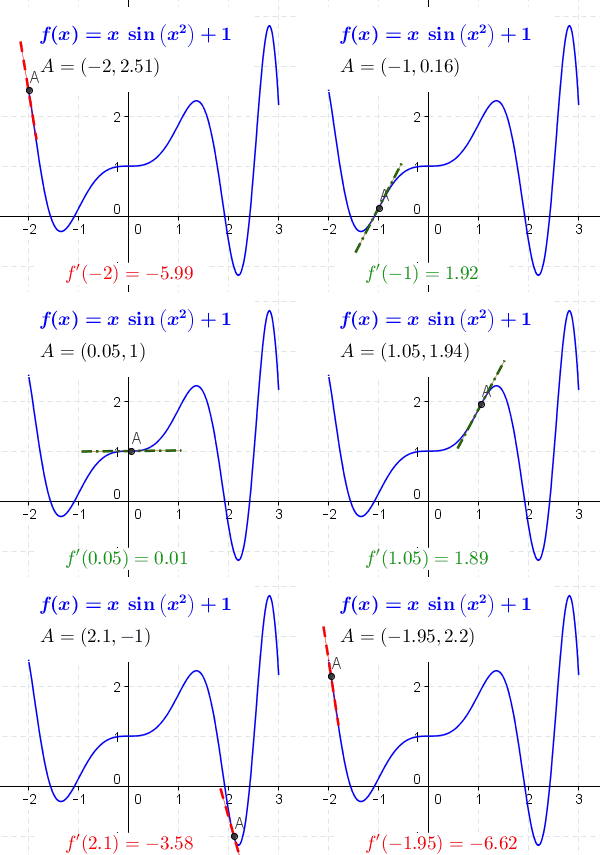
The graphic below shows how each data point has its own Slope() value and is easy to visually see what this is:

So with this example, we have 6 values which could equate to the last 30 seconds (on a 5 second interval). As we can see, value 1's index would be low/slow in the History List, whereas, value 6's index would be much higher, thus allowing us to determine how we wished to react to that unfolding scenario. We could also obviously, look at each single pair of data points as direct comparisons, ie (1-2),(2-3),(3-4) etc... which would give us the index for any given change on the arc.
In terms of setting up the Historical List properties, we would simply ask to have the index returned into the History List for the data point NOW vs the data point 5,10,15,20,25,30 seconds ago etc (or 5s vs 10s, 10s vs 15s, 15s vs 20s etc). This would then allow us to scan the history list to see if the index values were increasing/decreasing rapidly, thus signalling better entry/exit points. Think of it as a numerical equivalent of the visual that we see when eyeballing the graph above.
Sorry for the essay, just wanted to explain it fully.
In simple terms, it would be nice to have a *rate of change* function applied to History Lists based on time (A,B) and value (A,B) comparison. This would allow our rules to have *eyes* on the accelaration of change on a related series of data points over the same fixed time intervals
[edit] thanks SB for the more inspiring graphic that explains things perfectly!
